New York Botanical Garden — an information architecture case study

The New York Botanical Garden is an iconic living museum, a major educational institution, a renowned plant research facility, and a conservation organization. NYBG is a uniquely data-rich educational and research environment, connecting gardening to the arts and preserving rare plant collections to attract a variety of visitors. Guests also visit the NYBG site for various reasons; to find out about the location and hours, to purchase tickets, to research exotic plants from its collection, and to plan special events. The main purpose of this project is to redesign NYBG’s site structure and to improve the overall navigation system.
Scope of Work
In our research, we were analyzing every facet of the NYBG organization and its website. We conducted a Mission Model Canvas to understand NYBG’s goals and its key value propositions. We used a competitive matrix and feature analysis to help establish their competitive advantage. From the data that was found from the tree study, we can see the obstacles in their information architecture. The obstacles that were discovered are lack of structure, confusing labels, and crowded search engines which caused user frustration when they go on the website. The report is intended to improve the overall navigation system and make the website interface more intuitive. We aimed to improve the flow of navigation and minimize the pain points to the users. This was done to help the users to locate their desired information most easily and quickly as possible.
Roles/Responsibilities
The New York Botanical Garden Information architecture redesign is an individual case study that was developed by students from the Experience Design Immersive Program in General Assembly. The “Discover” design process was done in collaboration with two classmates from the program, meanwhile, the rest were completed by myself.
The Problem
We believe that The New York Botanical Garden’s navigation menu is lacking structure, its site map is crowded with duplicate information and the site can be made more compact by consolidating similar items. By organizing New York Botanical Garden’s site structure. This will help plant enthusiasts locate desired outcomes more easily.
How might we redesign NYBG website to provide our plant enthusiasts with a heuristic experience?
The Process: From Insight to Action

1. Discovery: “Understanding the Business:
1. Mission Model Canvas
We conducted a mission model canvas to provide a picture of all the parts that are important to the users and the company. From there, we understand that the value propositions are: providing a peaceful and safe place for all, a beautiful location for photographers/event planners, and rich data research for plant scientists.

Our Key Finding:
- The NYBG serves a variety of important functions. Major expenses which account for 90%, are almost equally split between conservation, horticulture, exhibitions, outreach, operations, and administration
- Users are far more varied than simply nature lovers. Visitors include photo/film creators, researchers, event planners, families looking for activities, students, etc
- Users have different needs and the NYBG works to provide different solutions for each, this requires committed maintenance, education, exhibitions, event facilities, etc
2. Competitive Matrix
We conducted a mission model canvas to provide a picture of all the parts that are important to the users and the company. From there, we understand that the value propositions are: providing a peaceful and safe place for all, a beautiful location for photographers/event planners, and rich data research for plant scientists.
Key Finding:
The New York Botanical Gardens is in a position where it has a good assortment of activities at a reasonable cost, relative to other New York City landmarks and event spaces.
3. Feature Analysis: What other company do
As we explored above, the NYBG exists within a competitive environment that reflects its various beneficiaries and their needs. Feature analysis helps us to understand the users’ expectations as they interact with their competitors and comparators. Although comparators do not compete directly with the NYBG, they share certain user problems and can offer helpful solutions.

4. Heuristics Evaluation: Evaluate the existing product
Heuristic evaluation helps us to find problems in an interface design. We use heuristics evaluation to evaluate a current product, inform choices in planning, design, and development. Heuristics can also eliminate elements that clearly violate established design standards before exposing them to time-consuming and expensive user testing.
Our Key Finding:
- Clarity about navigation is a major site-wide problem
- Navigation labels do not map consistently to user expectations
- Navigation problems also significantly detract from Usability and Fundability
- NYBG’s site is not WCAB compliant for speech readers
2. Research
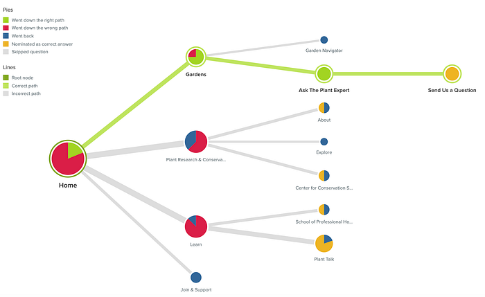
1. Tree Study (Existing Website): Fast, Iterative Evaluation of Menu labels And Categories
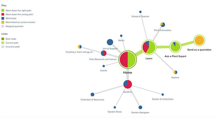
Tree studies help us map out and evaluate the existing NYBG site’s information architecture (IA). Using the Treejack tool by Optimal Workshop, we were able to model the current site’s IA and ask 10 test users to complete three navigation tasks. Our results can easily differentiate between direct/indirect successes and direct/indirect failures, indicating not only if users completed the task, but how.
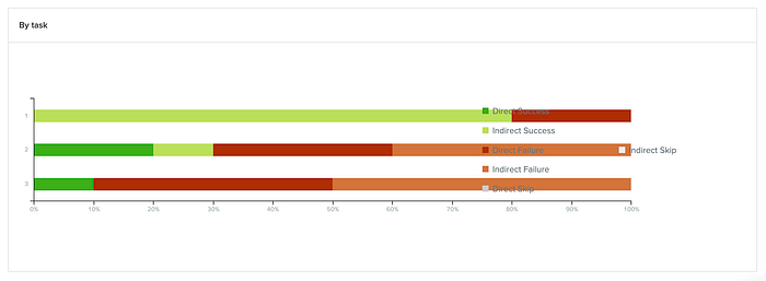
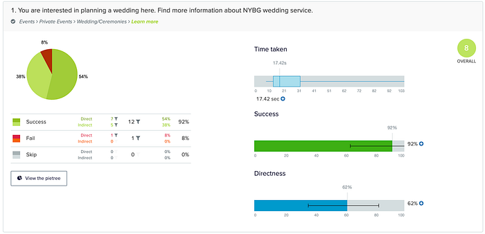
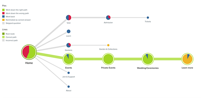
Task 1: Planning a Wedding
- You’re interested in planning a wedding here. Find more information about the New York Botanical Wedding service on the site

Task 2: Asking a Plant Question
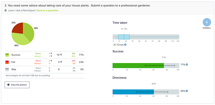
- You need some advice about taking care of your house plants. Submit a question to a professional gardener.
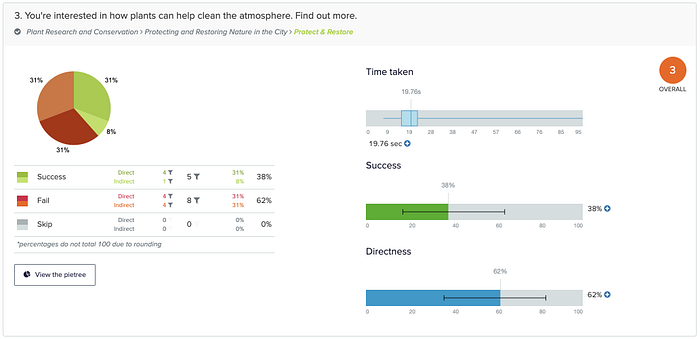
Task 3: How do plants clean the atmosphere
- You need some advice about taking care of your house plants. Submit a question to a professional gardener.
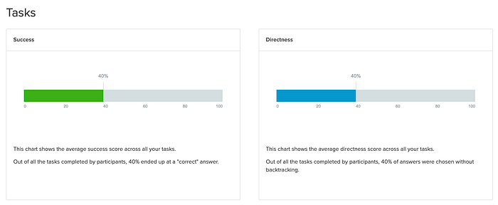
Our Key Finding:
- Overall navigation is not intuitive with only a 40% success rate across all tasks
- Paths to failures start at the primary navigation level with approximately 75% of all navigation errors
- Users found primary navigation labels “Learn”, “Plant Research and Conservation”, and “Gardens” to be vague and were unsure of what would be included in their secondary subgroups
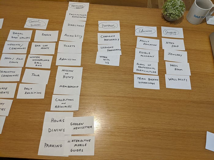
2. Card Sorting (Existing Site): Uncover User’s Metal Models for Better Information Architecture
Card sorting is a quantitative user research method that gives us insights into users’ mental models of the information architecture represented digitally on the site. With Closed sorting, users sort pages into existing primary menu labels; in Open sorting, users name the menu labels themselves. These insights will help us organize and label an IA that minimizes obstructions to the user in completing their desired tasks.
Our Key Finding:
- Labels on the NYBG navigation fall far short of the users’ model with users only finding what they are looking for with a 46% success rate
- Users categorize Private Events in the Event category
- Users are often confused over similar secondary and tertiary navigation labels with different meanings (Group visit, Group tour | Gardens & Collections, Collections & Resources)
3. Re-Define
Revised Problem Statement
When plant enthusiast visits the New York Botanical Garden website, they want to find their desired data, fast. They want to be able to ask their questions to professionals in the field of horticulture. Frustration comes from poor navigation and overcrowded labeling. How might we provide intuitive site navigation for our plant enthusiasts so that we can help them locate their desired outcome?
04. Design: Information Architecture
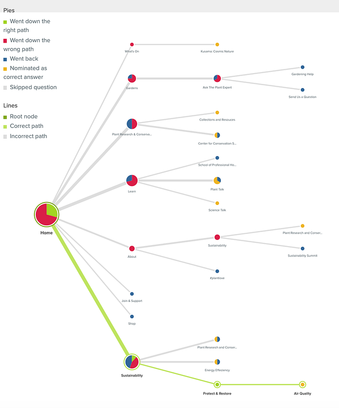
1. Tree Study (Proposed Site): Evaluating proposed site structure
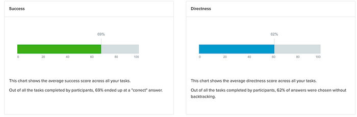
We conducted a second tree study for evaluating the findability of the content in the NYBG proposed website. This was done with 16 participants and giving out 3 simple tasks, On the first tree study (Existing Site), the overall navigation is not intuitive with only a 40% success rate across all tasks. When we compare the existing site and proposed site success rate. We can see that the proposed site has a 29% improvement and directness has a 22% improvement. The average time is about 1 minute and 45 seconds.
Task By task statistics
Task 1: key insight: Results show that 54% of users were successful at finding “Events” with the direct path, meanwhile, 38% of people took an indirect path. Only 8% Failed the task. The study shows that the category is findable and navigation is intuitive.
Task 2 Key Insight: On task 2 results from a Treejack study shows that 57 % of all users were successful at finding “learn” as their first clicked and 67% of user clicked “Garden” as their first choice when looking for “Ask a Plant Expert”. That could also mean that users found both primary navigation labels analogous.
Task 3 Key Insight: On Task 3 with only 31% success rate. 62% of participants chose “Learn” as their first step. A task that has a low success rate shows that users found primary navigation labels “Plant Research and Conservation” unsure. It might indicate that the first click “Learn” with a 62% direct/indirect fail rate shows where users initially expected to find that information and suggest where the item should be moved.

2. Close Card Sort: Proposed Site Navigation
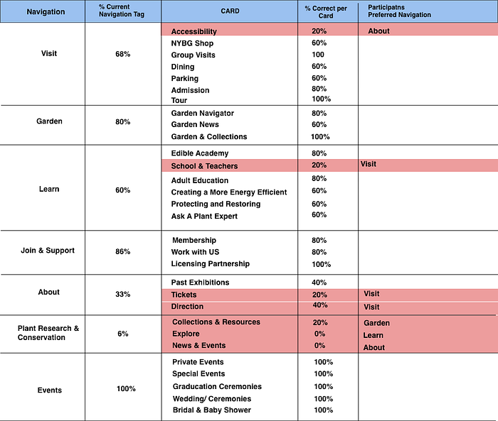
Closed card sorting is a variation where users are given a predetermined set of category names, and they are asked to organize the individual cards into predetermined categories. This research technique for discovering how users understand and categorize information. My proposed navigation has 7 categories: Visit, Garden, Learn, Join & Support, About, Plant Research & Conservation, and Events, which included 30 cards labeled with headlines representing the existing site content. We used this research method to test out the users’ ability to fit the content into the “correct” bucket. It’s like solving a puzzle then naturally matching content to categories.
Key Finding:
- Visit — 68% of participants agreed on this grouping. Out of 35 cards, 24 cards were placed under “Visit”. However, users expected card “Accessibility” to be grouped with “About”
- Learn — When we conducted tree jack testing task 3 and asked users to locate a category “Protecting and Restoring”. Out of all our participants, 93.3% selected “Learn” as their first initial click. On close card sorting, we have 60% of users agreeing to group “Protecting and Restoring” with “Learn”. This proves that users agree on the categories.
- Join & Support — Join & Support has a high 86% success rate with high success rate which shows that users agree with this grouping.
- Plant Research & Conservation — • This grouping only works out to 30% of participants, which means that 70% of participants disagree with that placement. 80% of participants placed “News & Event” under “About”
3. Sitemap: Why is a website sitemap important?
The Sitemap is a file where you provide information about the pages, videos, and other files on your site, and the relationships between them. Well-structured content will provide users with more accurate search results when they are looking for keywords or key terms. However, a well-established organization like New York Botanical Garden’s site structure seems perplexing for some users. From the existing sitemap, we can see the obstacles in their information architecture. For instance, the obstacles are, lacking site structure, confusing labels, and crowded search engines; which caused user’s frustration when they go on the website to search for information or to plan special events. Moreover, a well-designed sitemap gives a pleasant experience to visitors, leading to more conversions. Based on the research we found, we were able to make the site map more compact by consolidating similar items and merge analogous sections.


Key Proposal:
- NYBG Shop: For the proposed site map, I proposed to remove the primary navigation “Shop” and keep the “NYBG shop” section under “Visit”. I did this because they both link to the same site “NYBG Shop”. Additionally, from the card sorting data, 60% of participants placed “NYBG shop under “Visit”.
- Sustainability: I proposed to remove “Sustainability” on the primary navigation, and moved the rest of its sub-contents to “Learn”. In the Tree jack research task 3 (proposed site), 94% of participants choose “Learn” instead of “Sustainability” and from card sort results, 60% of the cards were placed under “Learn”. This information is what guided my logic in my changes.
- Event: I added “Events” on the primary navigation and moved “Private Events” and its sub-contents from “About” to “Events”. From the result of Treejack Task 1 (proposed site), 80% of users were successful in finding “Events” as the direct path. 25% of participants took an indirect path. The study shows that the category is easy to ascertain and that navigation is intuitive.
- Ask A Plant Expert: “Ask A Plant Expert” was under “Garden” on the existing sitemap. After first card sort testing (existing site), 60% of participants placed it under “Plant Research and Conservation” and 40% of participants placed it under “Learn”. On my 2nd card sort testing for the proposed site, 60% of participants placed under “Learn”. On my Treejack task 2, 77% of participants click “Learn” as their first initial step. Therefore, “Ask A Plant Expert” was moved under “Learn”.
Next Step:
The goal is to better understand how users interact with our redesign information architecture. My next step is to complete the Hi-Fidelity wireframes and conduct a usability test. I want to know what we could be done better to enhance their experience.
